Welcome Back for week 2!
To be honest this week was slow going. I spent the week trying to pull a plan together for the two spaces, and get my samples in order so that I could make some decisions. I think I have a good idea now and ready to get this ball moving.
Let’s take a look at my concept boards shall we?
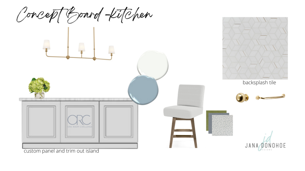
Kitchen Island– The biggest change we will see in my kitchen will be with the island. I have contracted a local company to come out and completely redo it with trim and paint it this beautiful blue color. Since the island is the focal point of the space I need this to be done correctly. Especially the cabinet paint! You will see this completed middle of May.
Backsplash– I am so ready to get rid of the textured wall backsplash…well textured walls in general!! I went back and forth on keeping my backsplash simple and clean or jazzing it up a bit. I think this beautiful polished marble with brass in a hex cube pattern is unique, sophisticated, clean and modern. It checks all the boxes plus some. Excited to see this come in.
Barstools– I found these Serena and Lily swivel barstools on marketplace. I bought 4 of them, unfortunately one of them immediately broke in the back. The jury is still out on a repair. They currently have a gray perennials fabric on them. Perennials is a very good performance fabric so I am on the fence about reupholstering them. The gray is not terrible, just not that exciting. What would you do? Leave them or reupholster to something more exciting like I have in my concept board?
Kitchen Island Light– This beautiful Pallas Chandelier from Kichler is so simply elegant. I knew I wanted a linear chandelier above my island instead of the more popular pendant lights. My kitchen island is offset from the back wall where my range is and my sink is also off set on the island. I have a lot of off set stuff happening in the kitchen. No nice symmetry that I like to see when I am designing a kitchen. 🙂 I felt that if I did 2 pendant lights that would only exaggerate and highlight the fact that nothing is lined up in this kitchen. I am excited to hang this beauty.
Knobs– The knobs are on! I love these traditional ball knobs in brass. They add such a classic look to the kitchen. I can’t wait to see them with the blue island. Yummy!
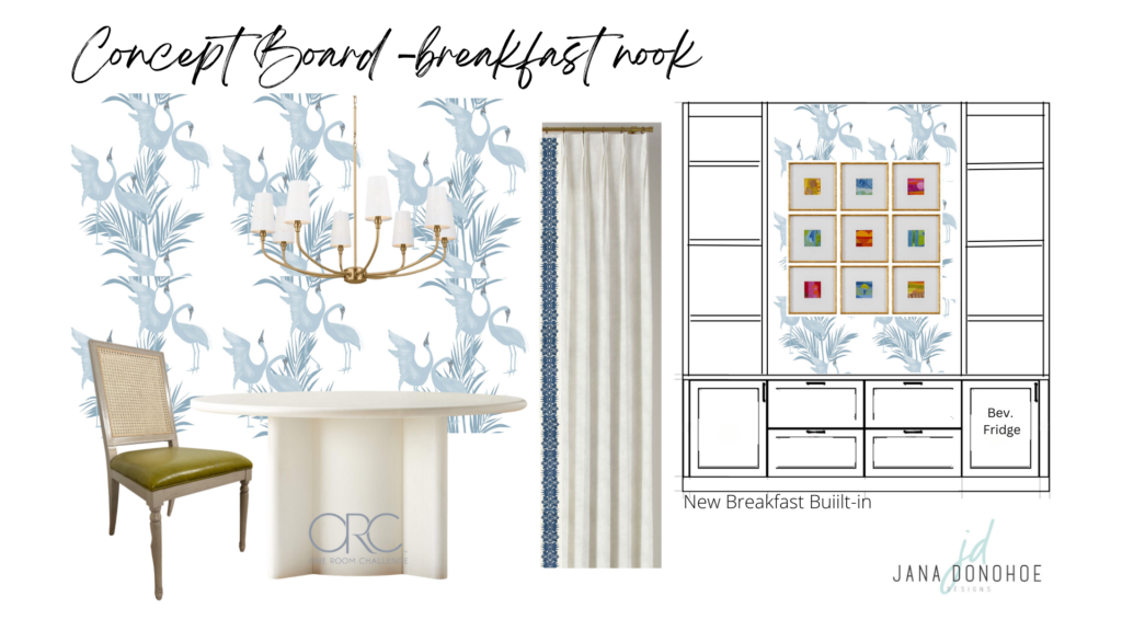
Wallpaper– I knew from the moment we moved into this house that I wanted wallpaper in my breakfast nook and about 12 other places too. lol. What can I say. I LOVE wallpaper! I had a few picked out but ultimately I selected (and by IG most votes) the Brolgas Cranes by Milton and King won. These guys are going to be a fun addition to the space. It’s classy, yet whimsical and will work great with my blue paint color I selected for the island and built-ins.
Built-ins– You guys I did not realize how lucky I was in our last house to have had so many built-ins. This house is bigger then my last but I don’t have the storage space to put my millions of accessories. Currently, I have a whole closet under my stairs that has boxes of accessories waiting for a place to go. The breakfast nook is the perfect place to start. I have ordered IKEA Sektion cabinet frames and Semi Hand Made cabinet fronts that I can paint. Custom on a budget. I have never used IKEA cabinets before so I will definitely let you know my honest opinion on quality.
I need more fridge space so I thought the addition of a beverage fridge in the built-in will free up space in the kitchen fridge and will be easier for the kids to grab their drinks from here after school.
Chandelier– Another great find from Kichler! The Adeena chandelier is beautiful and elegant with a little twist. The shades are perforated white metal. I can’t wait to see how the light bounces around in the room. I love the soft curves and the unique details of this chandelier!
Table– Unfortunately, I think my other table has to find a new place. Once, the built-in goes in. The space for my 80″ table will be extremely tight. It’s also a bit formal for the space and our more casual Colorado lifestyle now. I love the idea of swapping it out for a more casual round table. This will free up space and generally makes dinner conversations easier and better. The white-ish color I think also sets off my existing chartreuse dining chairs.
Drapery- I’m keeping it fairly simple here. A beautiful off white linen with this Iris Apfel trim to contrast and add some flair.
Artwork- One of my favorite things is adding artwork to a space. It can bring an entire room together. I love this set of 9 with the most beautiful range in colors and patterns.
If you have been watching my IG stories you may have seen that I did hang wallpaper liner in my breakfast nook in preparation for the wallpaper. I’ll talk more on that product and installation next week. I will also be heading to High Point Furniture market this week so will do my best to keep up here.
As always you can check out my IG for some behind-the-scenes sneak peeks, design thoughts, products coming in and other fun stuff.
There is always great design inspiration happening over at One Room Challenge be sure to check it out!
Cheers,
Jana
